Last week we introduced recovery statistics for investor’s personal portfolio and we are continuing in similar lines for the entire platform portfolio.
Introducing the recovery rate graph for Bondora
We are currently working to bring you a graph that highlights the progress of the recovery on our platform level compared to expected recovery.
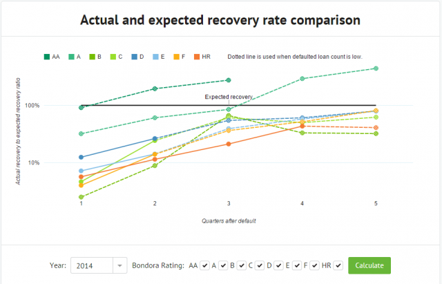
The graph will select all the loans that defaulted within the selected year and calculates their weighted expected recovery based on the expected recovery used in Bondora Rating. This will enable us to highlight the actual recovery to expected recovery ratio for each quarter after the loan defaulted.
In other words, the graph shows you how well the loans in each of the Ratings are recovering at certain points in time compared to what was expected in their Bondora Rating calculations.
Example:
If the weighted average expected recovery for a group of loans within a Bondora Rating is 30% and actual recovery after 6 quarters is 45%, then the graph will show this as 150% out of expected recovery has been reached for that Rating.
For data points where the count of defaulted loans is relatively low, we have used a dotted line to highlight that the results could be based on only a few loans and it can be subject to significant shifts when recovery statistics for additional loans will come in.
We hope that this graph will give you a quick way to see how the actual recovery progress is going and has been going throughout the time on our platform.
The new attention been given to defaults & recovery is very welcome & the new clearer Stage 1-5 system is a very good idea but why has the previous detailed information been overwritten, changed or removed without explanation?
All investors want is clear & precise information, the more detailed the better, even if it is bad news they would prefer that it wasn’t hidden or removed. An honest appraisal of the likelihood of future recovery for many of the early expansion loans that defaulted almost immediately would also be welcome as many are now over a year old with negligible apparent progress.
As mentioned in the previous update, we standardized the events to be able to give a quick overview of where the progress with a certain loan is. You can read more from here:
https://www.bondora.com/blog/recovery-statistics-updates/
Very nice idea – looking forward to seeing it implemented. But it appears that the scale is logarithmic – I think it had been more useful to use a linear one in this context.
After some testing we opted for logarithmic scale since in some cases where there were only a few defaulted loans, the actual recovery was so high that it made the rest of the graph barely readable.
It is possible to highlight a desired Rating line on the graph by clicking on its label in the legend and you will also see all the ratios and the number of loans at that stage when hovering with your cursor on any of the data points.
Country selection is missing there
Expected recovery seems meaningless to me. What I would like to see is the actual recovery compared to the total defaults for each country, for each time period, including recovery of unpaid interest.
The Bondora system of crediting payments against outstanding capital first rather than against unpaid interest is not helpful. Recovery should be measured against the total amount outstanding.
It doesn’t make any sense if you don’t show numbers for the different countries. There is as good as no recovery for spain until today but maybe up to 70%+ in estonia. So can’t simply mix up by rating, it will not show the truth.
The expected recovery is the weighted average expected recovery of all the defaulted loans, irregardless of what country they are from. If there is larger amount of Estonian loans, then the expected recovery is also more in lines with what was expected for Estonian loans within the Bondora Rating calculations. If there are more Spanish loans that defaulted within a Rating, then the expected recovery will also be more in the lines of what’s expected for Spanish loans.
In other words, the expected recovery is showing what was expected for these specific loans that have defaulted in this specific Rating during the selected year, as expected within the Bondora Rating calculation.
The composition of defaulted loans within a Rating will affect equally both the expected and actual recovery based on their weight in the sample.
Wait a Minute:
“The composition of loans will effect the expected recovery as well as the actual recovery?”
The more spanish loans, which have a very, very low recovery rate (0,5%), are factored into the sample size, the lower the expected recovery becomes. This would NOT harm /lower your Ratio at all as your actual, read: low, recovery will be paired with a low recovery expectation. So it seams like Bondora did a good job, but is that the truth?
Here is the missing link: If you adjust the expected recovery for the spanish/finish loans with poor actual recovery performance, you would also have to raise the Expected Loss Rate to factor in more spanish/finish loans. I forsee that the expected loss rate will have to be adjusted upwards, resulting in less return for the investor.
The more transparant way would have been to track the Return before and after Recovery for each loan year.
Please also bear in mind that losses can not be offset with income. Even if the interest rate appears to be high, the higher the loss rate, the less real return will end up in investor’s pockets.
These new default graphs will only cause more confusion for investors like so much of the information about returns provided by Bondora.
The default curves provided in the forum in the past were much more useful, but I have been asking for those to be updated for a long time now with no response.
You really cannot expect to gain the trust of investors by removing the choice of country when some of them have a very poor default rate and then trying to hide the result with meaningless graphs.
Each loan has an expected recovery rate. If loan A has a lower expected recovery rate than loan B with everything else being equal, then Bondora Rating calculation will assign loan A a higher interest rate.
More info about Bondora Rating is available here:
https://www.bondora.ee/en/invest/rating
This graph however shows how well the actual recovery on the platform level is performing compared to what was expected in the pricing of these loans.
In other words, if the expected recovery was low and actual recovery is matching what was expected, then the recovery was at par with expectations and as a result, successful, since this level of loss was already accounted for in the pricing of the loans.
If recovery is higher than expected, then the recovery process has worked out better than expected and the outcome is better than predicted while pricing the loans.
However, since the expected recovery on the graph is based on the weights of defaulted amount, then any loan with less than expected recovery, irregardless of how high or low the expected recovery is, will bring the result down equally, based on its weight.
Let’s look at an example:
Loan A defaulted:
– outstanding principal: €500
– expected recovery rate: 30%
– actual recovery: 15%
Ratio on the graph: 50%
Loan B also defaults:
– outstanding principal: €500
– expected recovery rate 60%
– actual recovery: 60%
Ratio for these two loans based on the weighted average expected recovery: 83%.
Loan C defaults:
– outstanding principal: €1000
– expected recovery: 10%
– actual recovery: 0%
Ratio on graph for those 3 loans shows that 68% of the expected recovery has actually been achieved at this point.
For more info on weighted averages:
http://en.wikipedia.org/wiki/Weighted_arithmetic_mean
Expected recovery is just a tricky statistic word for me, because we cannot knowing it. It is just to confuse investor because for them expected recovery = full capital recovery + full recovery of interest +full recovery of penalties for a majority of them
There is no rational or statistical reason to expect a full recovery in majority of the default cases. If the recovery were 100% as you described, all loans would be priced essentially the same since there is no risk of loss.
In reality, most loans don’t recover by 100% or even close to this and for this reason, it is reflected in the loan pricing through Bondora Rating – the lower the expected recovery, the higher the interest rate to cover this loss.
This graph shows you whether the recovery is better, same or worse than what was expected in the loan pricing. If the expected recovery for a loan during pricing was 30%, but actual was 40%, then the graph shows the ratio as 133% and your return for that loan is better than expected for such loans during pricing. If the actual recovery is below 30%, then this is also reflected in the graph and you can easily see that its recovery performance is below expected levels.
So how can you set an expected recovery rate when your defaulted Spanish loans have hardly achieved any recovery and have not been on the platform for long enough to even establish a true default level? It seems that about half of them have already defaulted after 12 months and they still have several years before they would be fully repaid.
Is there any actual historical data which allows you to set a correct target and if so can you please explain how that is calculated?